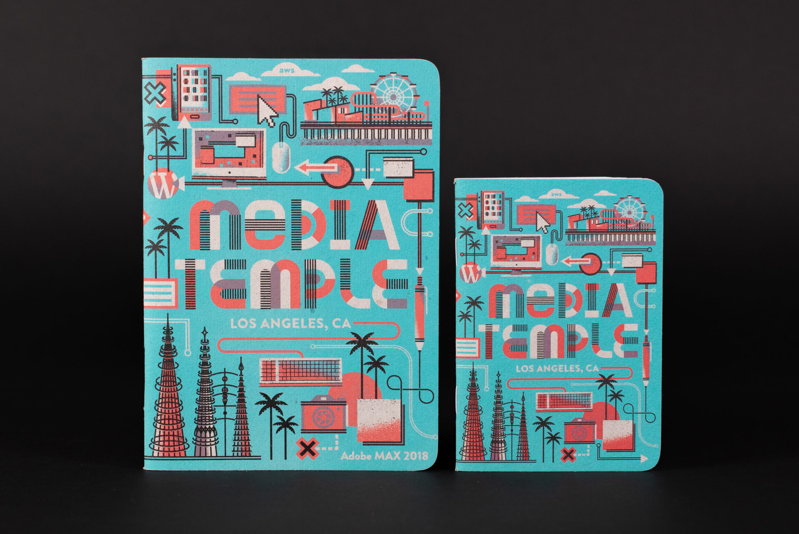
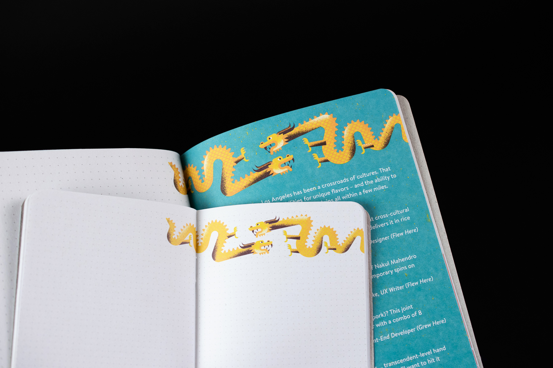
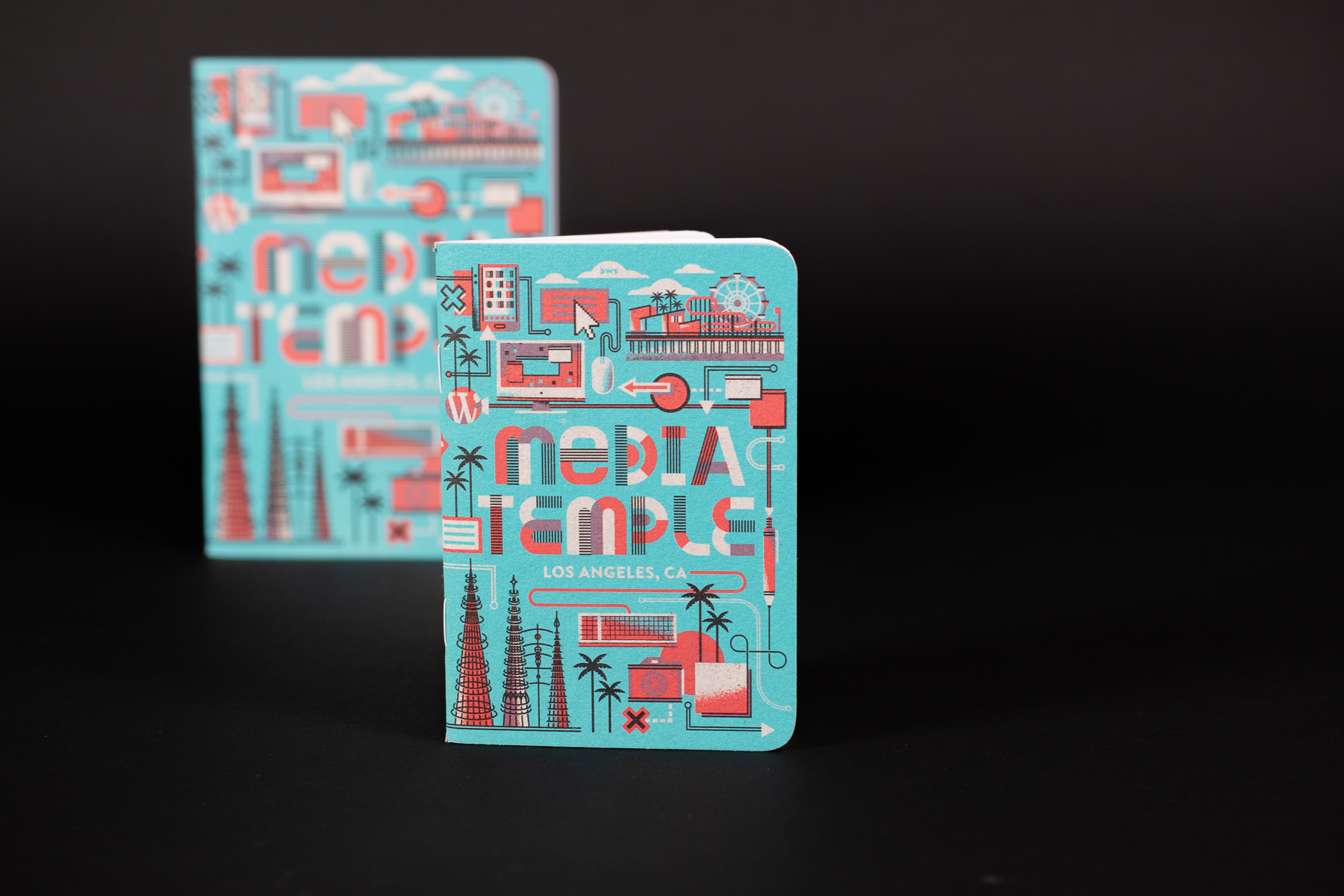
In this special two part post, we’ll learn how our friends at Media Temple created eye-catching multi-use books to share at events. With tips for exploring Los Angeles sprinkled throughout the illustrated dot grid pages, these books highlight their connection to LA while still providing a perfect space for notetaking, brainstorming, and making new connections.
Illustrator Eric Nyffeler will share some of his creative process in the next post, but first, the creative team at Media Temple, writer Mike Martens and designer Yu Chang, explain the project’s strategy (and why navigating a new city can be a lot like entering a web server).
What were your goals for Media Temple at Adobe MAX? How did the Scout Books fit into your efforts there?
One of Media Temple’s biggest strengths is also kind of unquantifiable – the approachable personalities of our team and the insider advice they can provide. It’s something you have to experience to really get.
With Adobe MAX being held in our hometown of Los Angeles in 2018, we figured we could demonstrate some of that personality and expertise by sharing our favorite ways to enjoy the city. Yeah, it’s not the technical web stuff people look to Media Temple for… but at the conference, there’d be a bunch of people in a place they’re unfamiliar with, looking for ways to make the most of the situation. That experience is similar to entering a new web server and having to work with all its unfamiliar complexity. So, getting advice on L.A. could give people a similar feeling as getting advice about web hosting.
Out of that concept, a guidebook of our Los Angeles recommendations seemed like an obvious takeaway for visitors to our booth. And we liked the idea of dual purposes for the book: Tips on where to go when you’re not in Adobe MAX sessions, but also a top-notch space to take notes during your sessions. We’ve had success with similar mixed-use concepts before, and Scout Books give us the flexibility to strike the right balance.
We’ve been working together for several years now, and each year you seem to outdo yourselves when it comes to the design. Can you tell us about putting these projects together and how you work with designers to create these amazing pieces?
Especially with recurring projects, we’re actively trying to outdo ourselves. (So, thanks for noticing!) We gather stakeholders and talk through what worked and what didn’t with previous iterations, looking at both our users’ experience as well as how well we communicated what we wanted. And at events, we watch what other brands do, and we’ll similarly analyze their approaches by trying to reverse engineer their strategy. This process covers everything: art, copy, interaction time, swag, activations, all that. From all this, we can build a clear vision of what we want to accomplish – with a strong sense of what will achieve it.
As a very small creative team, we then look for the best ways to supplement our skills and bandwidth. Like any creatives, we have a long list of folks we want to work with on projects, so we look for the right fit based on the concept. If they’re on board with our vision, we get to work.
We love to have a collaborative relationship as we put things together, and the lines between writer, designer, and artist are that-good-kind-of blurry. Everyone has a major hand in the final product, and our flexibility allows us to be nimble and seize on any unexpected opportunities that come up.
What was something cool/weird/unexpected from Adobe MAX?
Someone walked up to the booth wearing the shirt we’d created for last year’s MAX, and when our jaws all dropped, he said, “This is my favorite shirt!” It reminded us that as much as we’re always thinking forward, each iteration does make its own impact that sticks with people.
Anything our audience of designers/makers/creators should be on the lookout for from Media Temple coming up?
We recently launched a full redesign of mediatemple.net in collaboration with L.A. agency Wildlife. It’s a pretty bold update and a better playground for our agile approach to creative. That also has us doing a comprehensive update to our brand guide, so you’ll be noticing some gradual tweaks of everything we do.
Our list of potential collaborators is definitely still lengthy, and we’ve got some other big projects coming down the tubes. We’re excited, and we think that should give creatives like us reason to be excited too.
Thanks to Mike Martens and Yu Chang for sharing this look behind the scenes at Media Temple’s strategy for these custom notebooks! Can’t wait to see what they do next.


