Whether they know it or not, everyone appreciates a good font. But it’s also a niche industry mostly dominated by designers, so there’s not a ton of data on the economics of it. Mary Catherine Pflug of MyFonts wants to change all that. For the past few years, she’s been running a survey to collect data on the purchasing habits of fonts, and this year she made a book to share that data at TypeCon. We talked with her about the importance of the survey and why she chose to create a book to share it.
Your bio says you are a Foundry Specialist – can you tell us what that is?
Sure! As a Foundry Specialist, it’s my job to figure out ways to help type foundries (the businesses who create fonts). This involves anything from work related directly to products (analyzing sales data, providing font review & feedback, updating site data, etc.) to more big-picture industry initiatives like this research, which helps all type foundries, not just the ones who sell through MyFonts.
Can you tell us about MyFonts and the survey you ran about font purchasing habits?
MyFonts is the largest font retailer, with the largest base of font customers. This allows for the perfect environment to study the behavior of font customers and sellers. I run this survey every year to analyze the habits of font customers in order to provide much-needed data to the type industry. There isn’t much (if any) published research about marketing & sales in the font industry because it is such a niche industry. Thus, many marketing and pricing decisions are made based on assumptions or anecdotal evidence that may or may not be accurate. This is a big problem, and I am striving to fix it by getting more information out there.
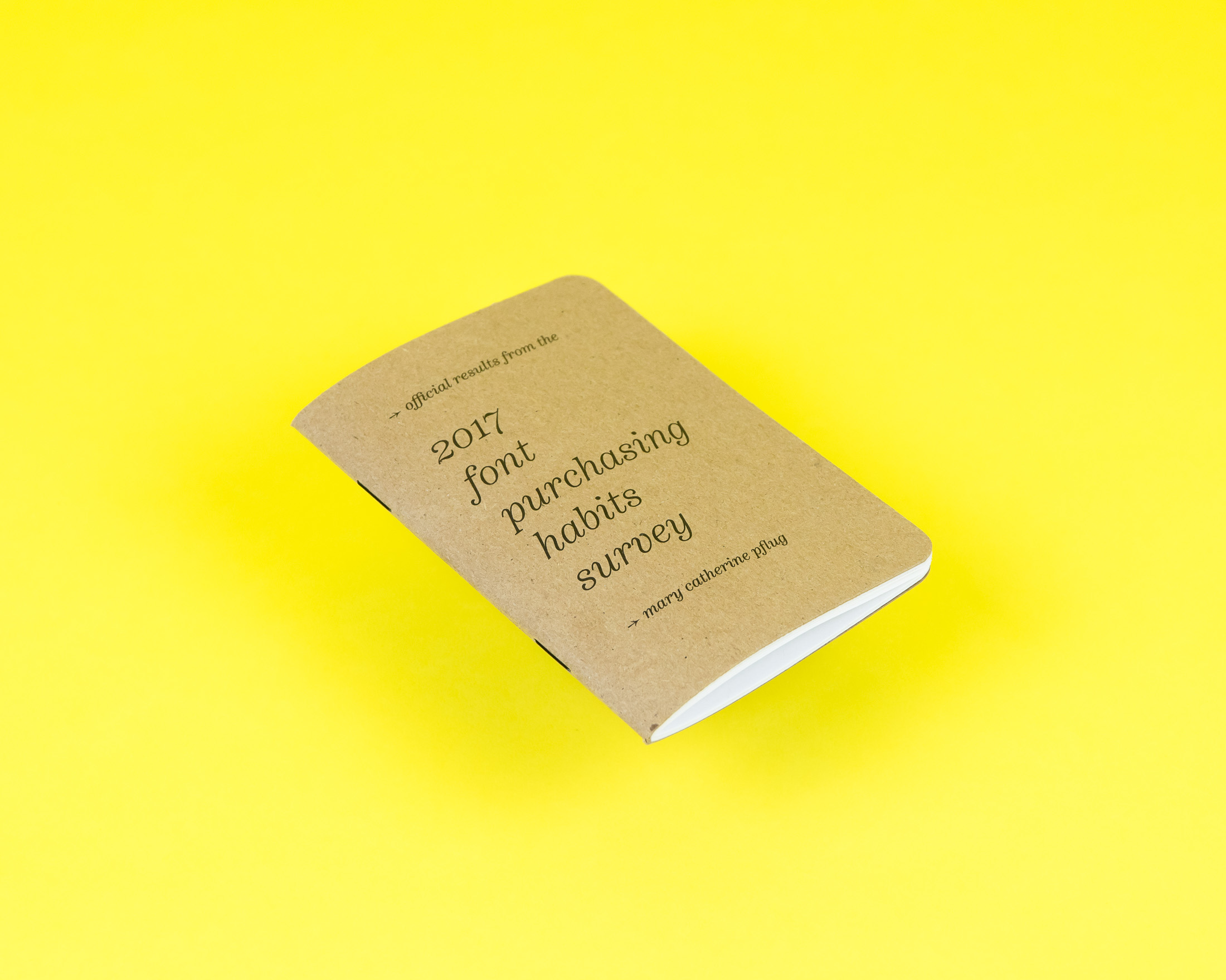
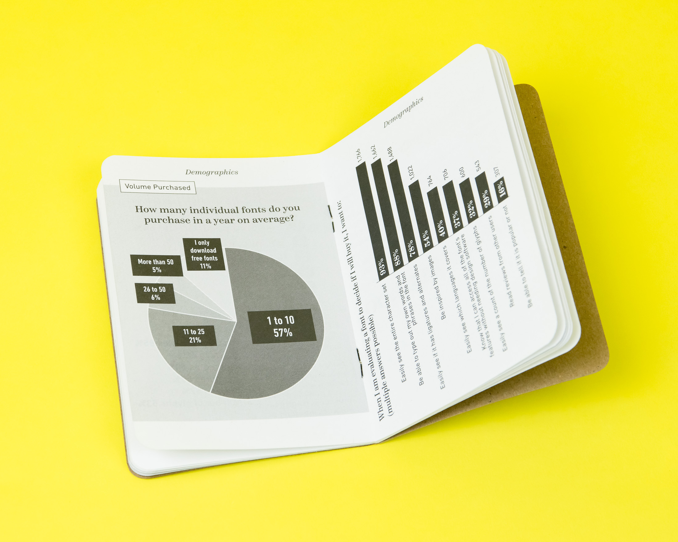
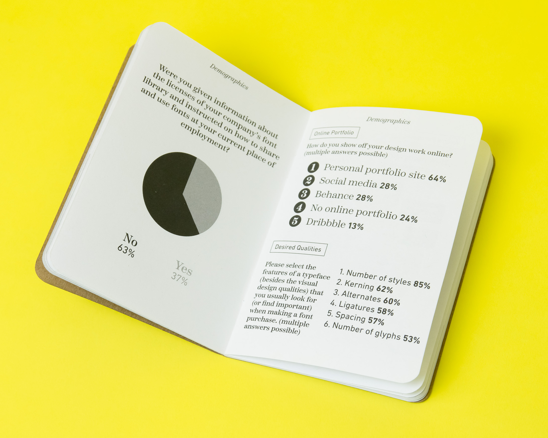
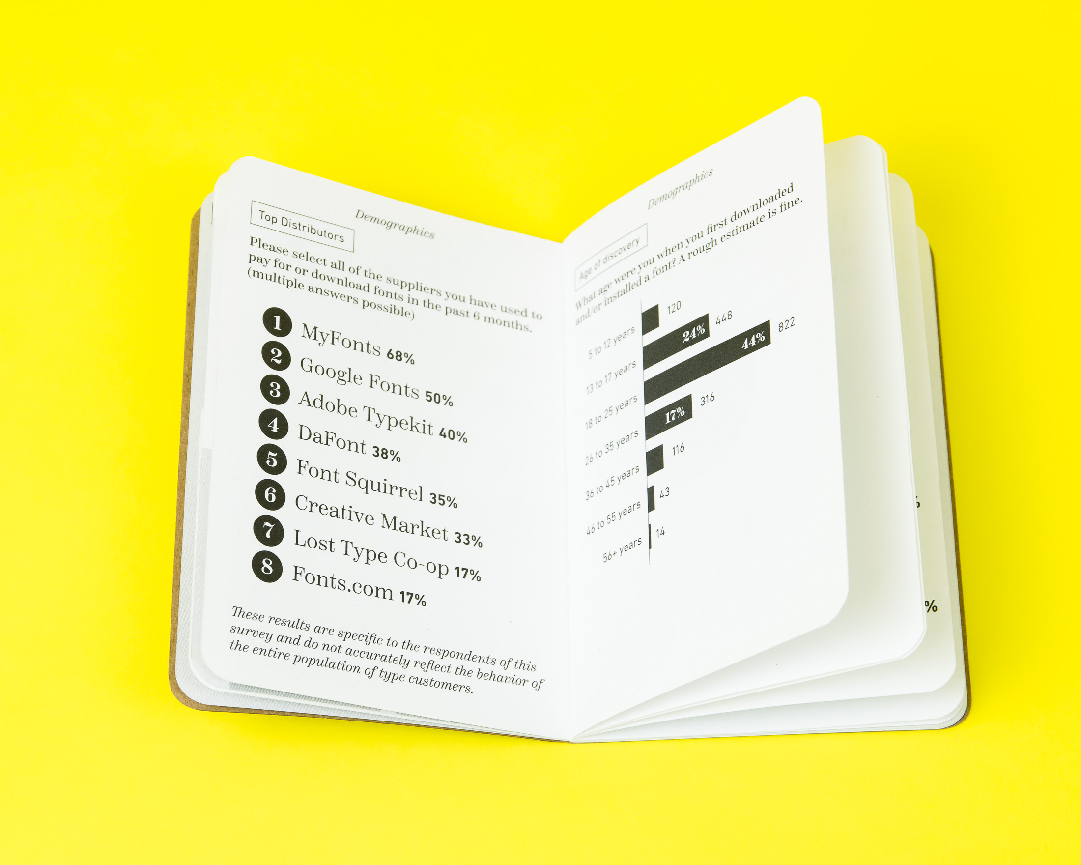
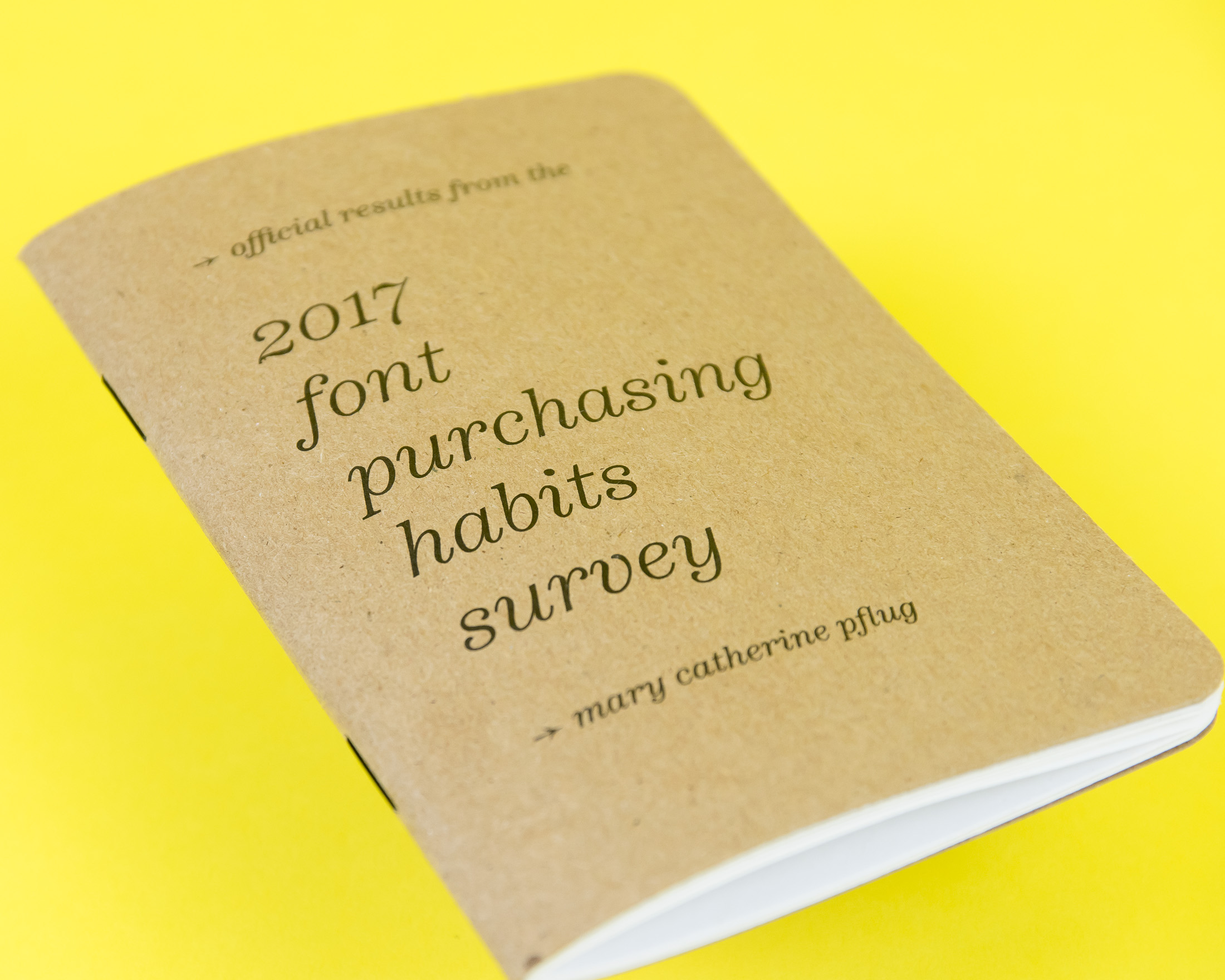
The Font Purchasing Habits Survey had 2,600 responses, and those who completed the survey to the end received a pack of 9 great fonts for free! It was a pretty long survey, with 45 questions, and the responses came from all over the world. Check out the full results of the survey!
Were there any surprising results in the survey?
Yes, tons!
– Do you think fonts can be sexy? Turns out, 57% of my survey respondents think they are!
– Do you associate discounting with lower quality products? Survey says, 66% of font customers don’t think discounted fonts are lower quality.
– Does the fact that a typeface has won an award impact your decision to buy it? Turns out, only 6% of respondents care about the awards won by the typeface!
The most important result was the volume of data-based-evidence that led me to draw the conclusion that the type industry is in a bubble. The type designer respondent group’s answers to survey questions differed significantly from the rest of the population. It is important for sellers and customers to find common ground.
What made you decide to make a book with the results?
Since I was presenting the results of the survey in a 40 minute talk at TypeCon, I knew I was going to be throwing a lot of data and information at the audience. I wanted TypeCon attendees to have a booklet of easily digestible information (with blank pages in the back for notes) that they could use during the talk to take notes, write down questions, and keep afterward as a quick reference.
Who designed the books? What was it like creating a book with this kind of content?
I made them myself, in a 3-day design-marathon! I came up with the idea for the booklet a bit last minute, so I had to move quickly to put them together. For me, it was really fun, since I don’t do design regularly in my job, but enjoy it. Since I did the research & wrote the talk myself, I was really familiar with the data and what I felt was most important to convey. Using black and white was also a great design restriction, which forced me to come up with solutions to design issues like emphasis or hierarchy that may be traditionally solved with color.
Do you have a favorite font/typeface?
Right now, I’m a big fan of Scotch, the newest release by Positype (and the main serif typeface I used in this booklet). But, my favorite typeface usually changes depending on what project I am working on. My go-to typeface for spreadsheets is Source Sans and my default typeface in Google Docs is Lato.
Huge thanks to Mary Catherine for talking with us about the book! You can find the digital version of the survey results here.