Who doesn’t enjoy a design with delightful splashes of color? But, let’s not sleep on the captivating possibilities of white ink! Whether subtly integrated into a design or the star of the show, white ink has the ability to elevate any book. Prepare to be inspired by a collection of past projects that beautifully showcase the magic of white ink!

Flood of Color With White
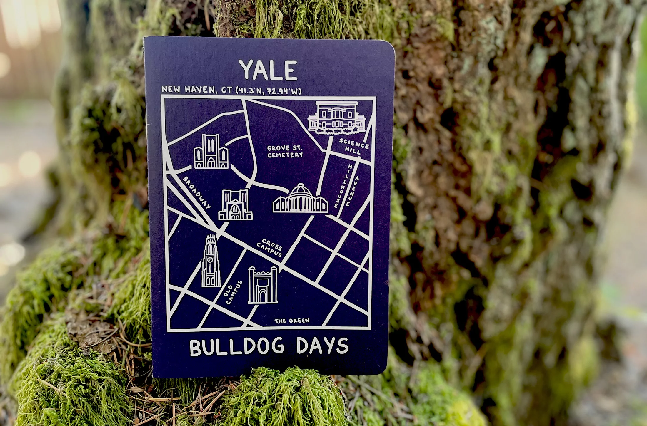
Our tried-and-true Kraft chipboard is the foundation for our covers, providing that classic touch. But you can change it up with a flood of color on the outside while maintaining the timeless appeal of Kraft on the inside. Unlock a whole new level of sophistication by contrasting it with your design elements in white, like Elizabeth’s design from Yale University. (Go Handsome Dan!)
Project Specs

White Ink Flood
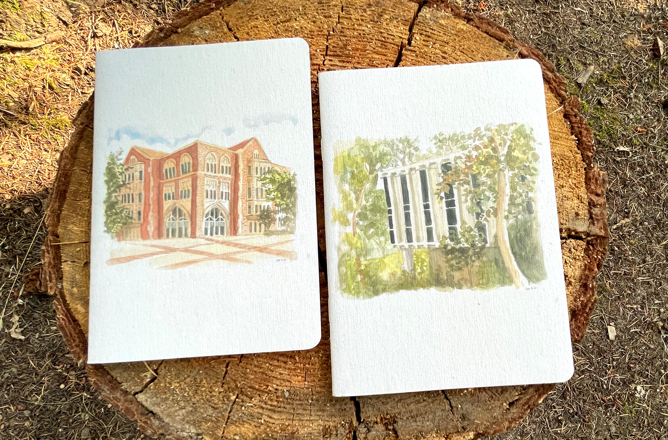
Here’s a flood design with a little twist. Whether you let the natural Kraft color peer through design elements or use a flood of white behind a full-color design for rustic charm, your artwork will stand out. Check out USC Annenberg’s beautiful designs using Suzanne Boretz’s original watercolor paintings. The flood of white exudes a polished feel!
Project Specs

White To Elevate
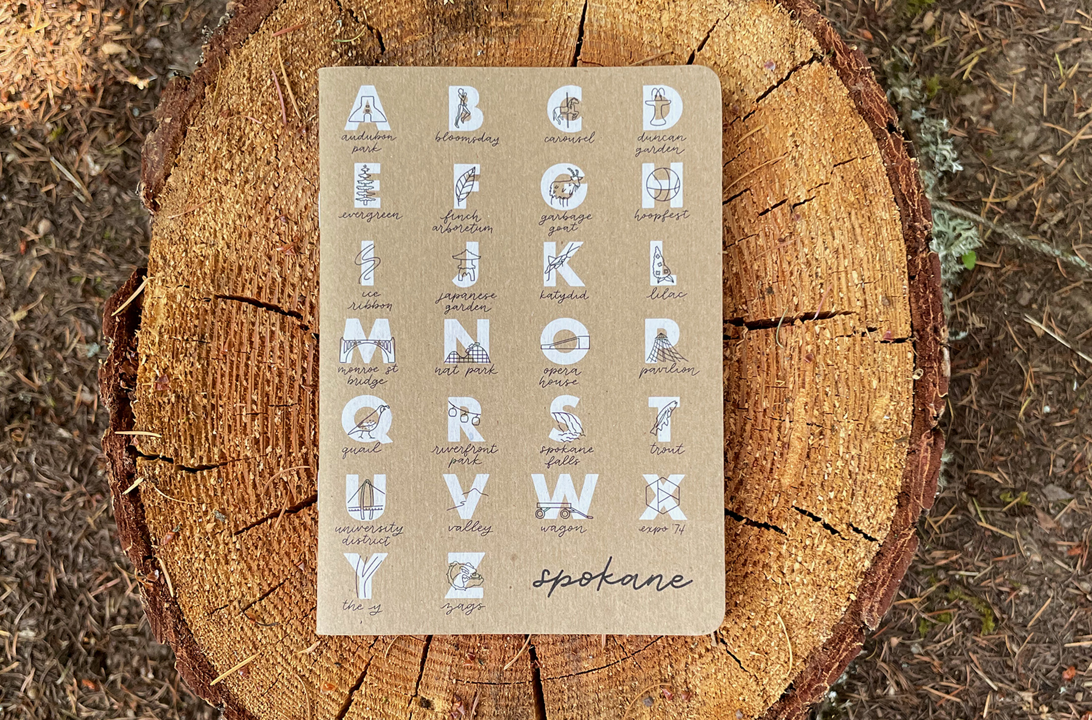
Beyond floods, there’s another way to create a contrasting design. Intentional and strategic uses of white ink create something truly special. The design from Typographics brilliantly uses white ink to highlight key elements, and Mary Peter’s Spokalphabet book below, from Goldfinch Lettering, effectively incorporates white ink as accents. If you like what you see, give Typographics a follow and grab a Spokalphabet book of your own here!
Project Specs

Project Specs

White As The Star
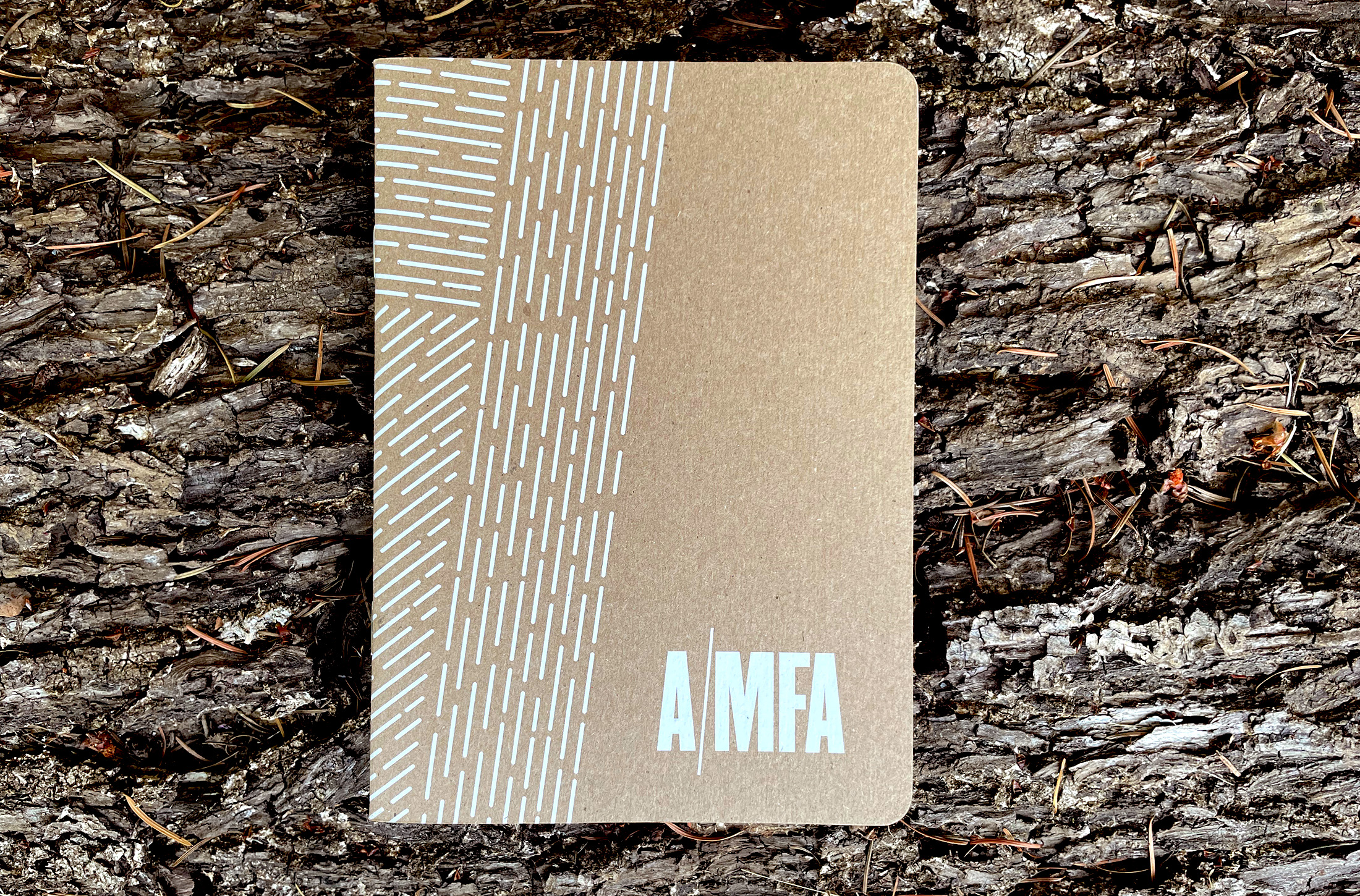
There is beauty in simplicity. Patricia Graves’ design for the Arkansas Museum of Fine Arts harnesses the power of white ink. With a subtle elegance, this project embraces the minimalist approach, highlighting the artwork against our Kraft covers. White ink takes center stage, commanding attention with every detail.
Project Specs
We’re thrilled to showcase this selection of remarkable projects. If you have an idea in mind, we’d love to connect and create something awesome!
