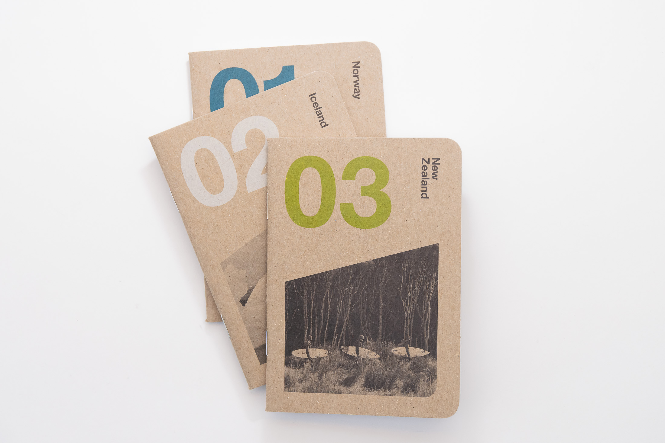
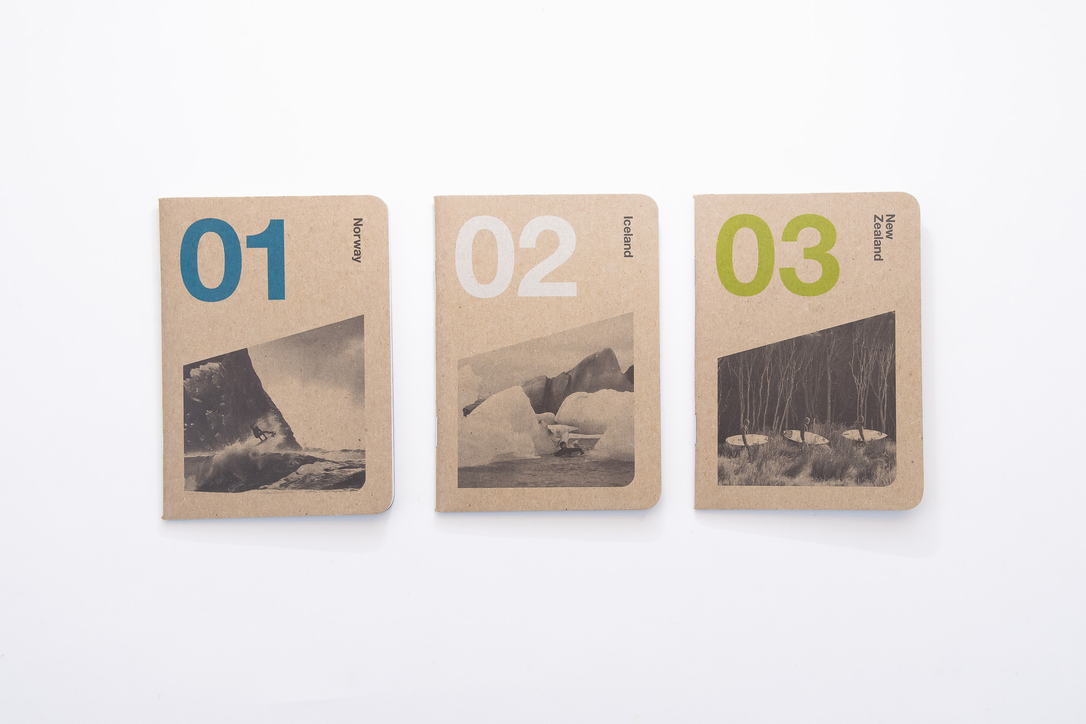
Simplicity done so well, it becomes elegance. That’s how we’d describe this series of books from Orange and Park, the California-based print studio of David Klinker, who creates gorgeous surf-inspired silkscreened art prints. We love the perfect trio of colors, the inclusion of black and white photography on the covers, and the generous use of white space that defies the diminutive form of these pocket notebooks. Check out our conversation with David about the origins of this trio of Scout Books.
Can you tell us about this series of books?
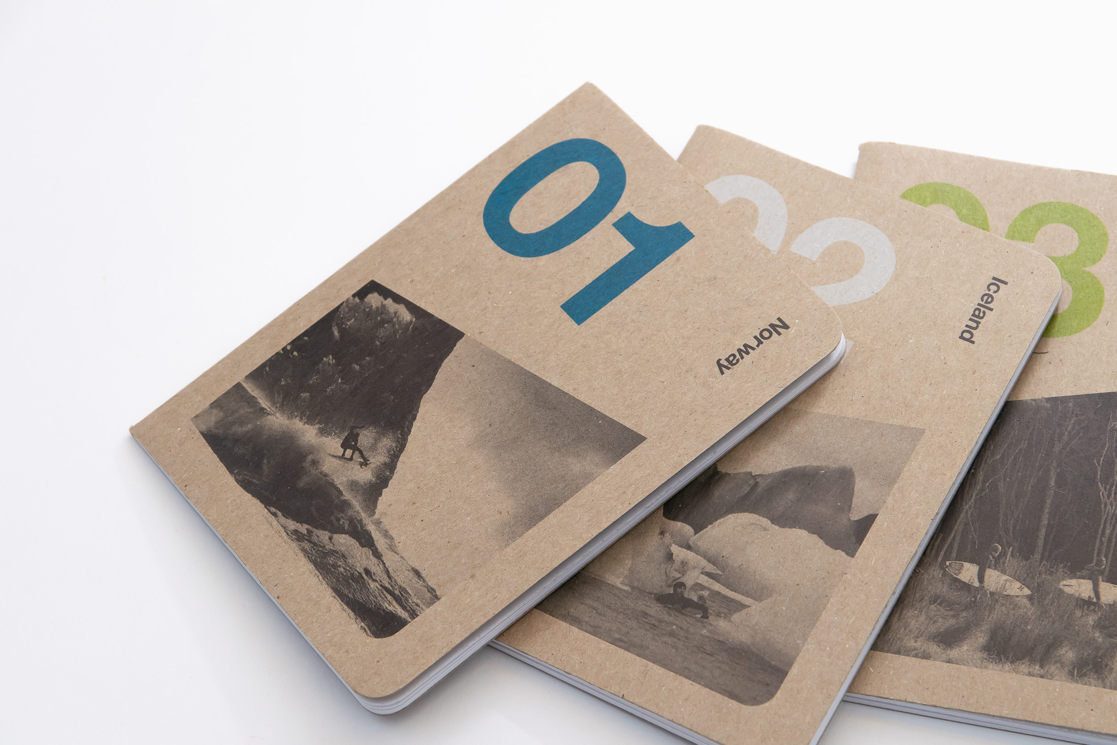
When photographer Chris Burkard discovered our California coastal and surf maps, he reached out to us to see how we could collaborate. Chris is constantly traveling the world, and I love sketching on the go when inspiration strikes, so putting our work together on pocket-sized notebooks made sense! We had recently found out about Scout Books, and thus the Orange & Park x Chris Burkard Scout Series was born. The Scout Books were a new format for us and a cool addition to the lineup of silk-screened posters and shirts on our website and in surf shops around town. And Chris would have something unique and original to sell and giveaway at his galleries, film screenings and workshops. The covers of the books feature shots of Dane Gudauskas shredding in Norway, Keith Malloy casually paddling through glaciers in Iceland, and three dudes getting ready to hit the freezing surf in New Zealand–framed by clean, modernist graphic design and typography by Orange & Park.
We love seeing Chris Burkard’s photography on the covers of Scout Books! Was it a challenge integrating photography into the design?
Chris always manages to fit a lot into the camera frame and is a genius with natural lighting. The small scale and limited color palette of the Scout Books meant focusing on images we could crop down to size, with interesting forms that would work well in black and white. We brought color back in through the graphic design elements, with different inks chosen for each book to help fill in the scenes Chris had originally captured in full color.
How does surfing and surf culture influence your design?
I’m fascinated with minimalism and the elegance, order and rationality of modernist graphic design. One of its masters, Massimo Vignelli, observed that the generous and skillful use of white space on the printed page was a peculiar attribute of American graphic design, and speculated that it was related to the “epic grandeur” and openness of this country’s landscapes. I was born and raised on Coronado, California, surrounded by water, with the Pacific Ocean surging against one shore and San Diego Bay lapping at the others. These expansive bodies of water are the white space of my life. At the end of a long day (or night, for that matter), I can always escape to the edges of the island to unplug from society and reconnect with nature. The need to create order and reduce visual pollution is evident in most of my art. Other recurring design features like rhythm, repetition, reflection and, of course, color selection are also directly related the sea and a life spent in its thrall and embrace.
You’ve been at this printing thing for a few years now. What’s it like running a print business in 2019?
It’s as tricky and rewarding as ever! One of the biggest challenges is keeping up with the latest way to reach new customers and stay connected with our audience. Over the years, we’ve ridden the roller coaster ups and downs of various online social networks (Tumblr, Ello), flash sale sites (Fab) and sharing tools (Pinterest). These days, it’s all about Instagram. Balancing the time it takes to create content for these ever-changing platforms with time spent on new poster and apparel designs is not easy. Fortunately, as long as people still live in actual houses and apartments, we’ll continue to seek out artwork to enliven our spaces and enrich our lives, regardless of the latest tech fad.
What’s something that you’ve discovered in the last year that our audience should check out?
My wife is from Spain, and we spent a lot of the last year in Barcelona and down in Andalusia. Olive oil literally grows on trees there and finds its way into nearly every dish we cook. One of our favorite desserts around the house these days is vanilla ice cream hit with a dash of sea salt and a drizzle of extra virgin olive oil. Quick, easy and unexpectedly decadent–don’t knock it until you try it!
Thank you to David Klinker of Orange and Park for taking the time to speak with us about the collaboration. You can find more about Orange and Park via their website, and on Instagram at @orangeandpark.