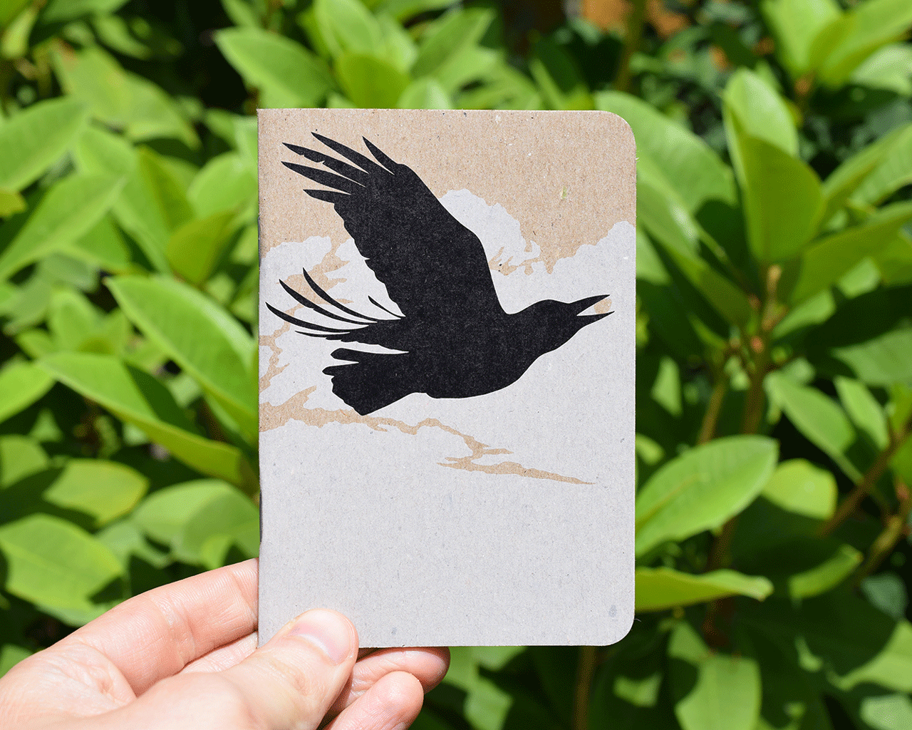


White ink on chipboard is kind of tricky – it can look great with a design that plays to its strengths, but it’s best to have clear expectations. While the ink itself is white, it is darkened somewhat by printing on chipboard, resulting in an off-white color.
The not-quite-whiteness of white ink is particularly visible when printed as a flood of ink, since the large ink coverage gives a lot of space for the chipboard to show through. That can work quite well if you’re looking for an off-white, cloudy look. White ink reads as whiter and pops more when surrounded by a darker color.
Due to the closeness to the color of chipboard, very fine lines, small text, and delicate design elements in white are less likely to be clearly visible against the chipboard background. Therefore, when designing with white ink, we recommend big, bold designs, and if you want the ink to really pop, surround it with a darker color for contrast.
White ink, since it is a color with special considerations and is much more time-intensive to print, comes with an additional fee. If you have any more questions about white ink, or want us to take a look at your design, please get in touch!