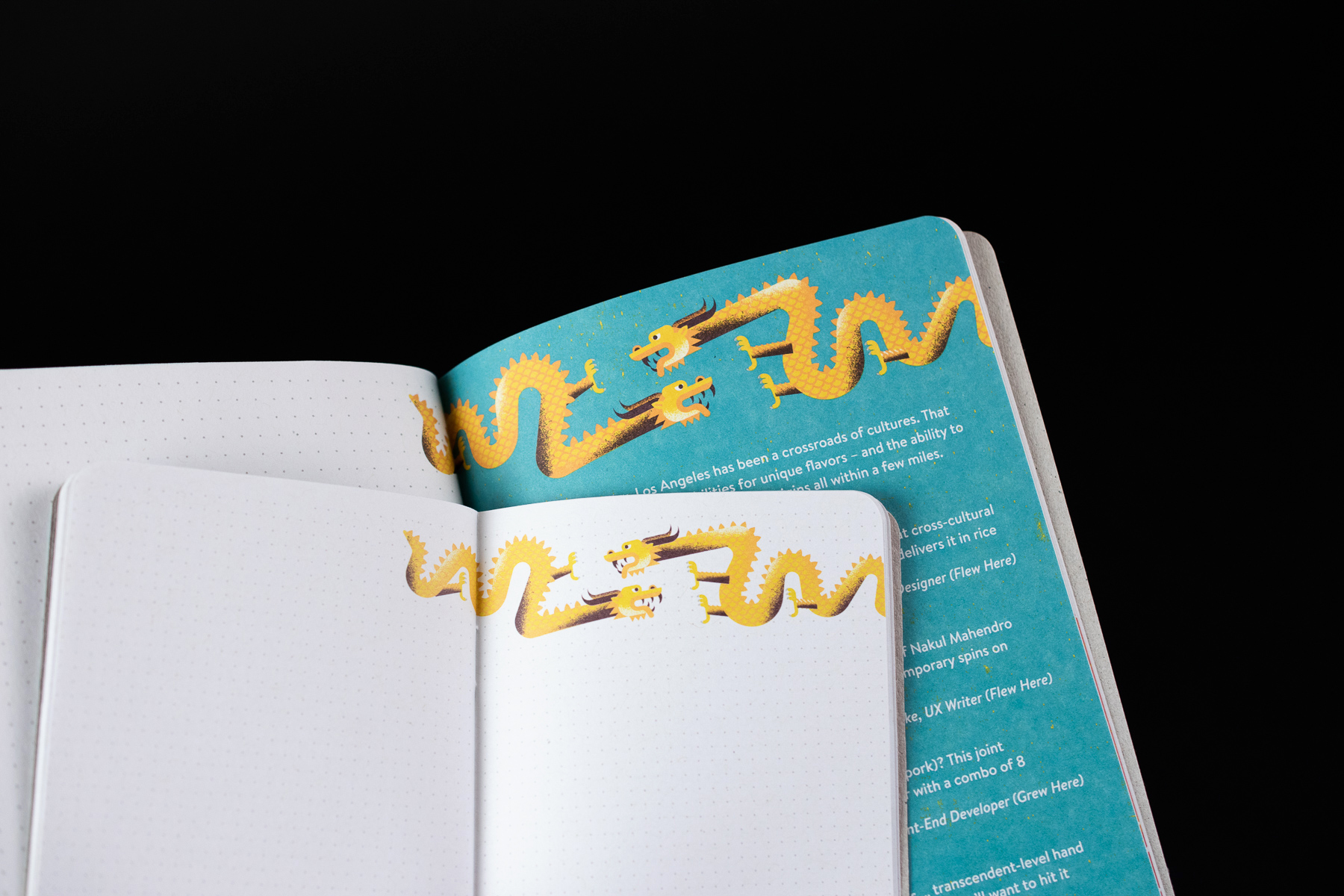
In this special two part post, we’re learning how our friends at Media Temple created eye-catching multi-use books to share at events. With tips for exploring Los Angeles sprinkled throughout the illustrated dot grid pages, these books highlight their connection to LA while still providing a perfect space for notetaking, brainstorming, and making new connections.
In the first post, the folks from Media Temple explained the project’s strategy and goals. Now, illustrator Eric Nyffeler shares his creative process and recommends the perfect music for long nights at the drawing table.
How do you brainstorm or get your first drafts/concepts out?
Whenever I get started on a new project, I love to go on a long walk, hike, or drive and let ideas rattle and bounce around inside my head. It’s nice to have direction in mind before I first put a pencil to the paper, and spending some time in my head is a good way to make some unexpected ideas shake out. Once I have some semblance of an overall idea, I like to throw out a ton of super loose sketches, just to see what I start to like. Usually coming back to those sketches a day or two later makes it really easy to see which of the doodles stand the test of time.
How did the visual concept for the Adobe MAX project turn into the final illustrations?
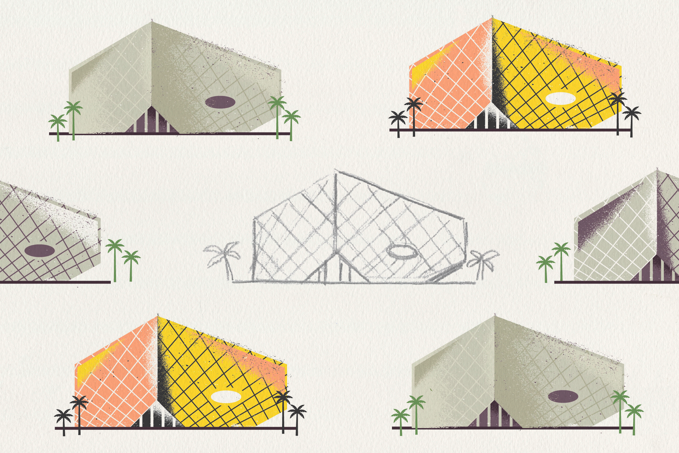
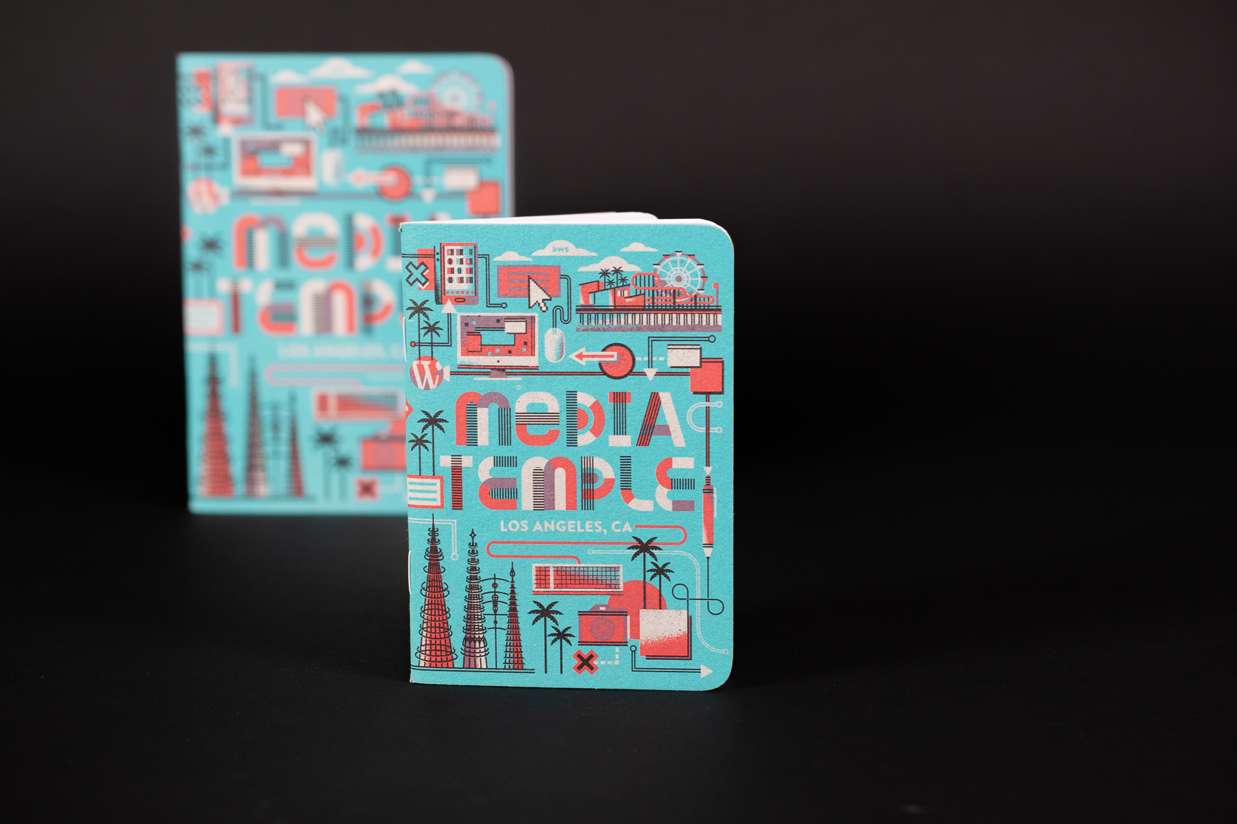
The concept for Media Temple’s Adobe MAX project was meant to be a curated list of Los Angeles’ well-known and hidden secrets. Where are the best tacos? The best bowling? The best architecture? These books were shared with the attendees of the conference, guaranteeing everyone to have a unique trip. After coming up with a couple dozen icons of famous LA buildings and hobbies, I decided to connect them all together with a series of diagrams and browser windows and tech elements, illustrating how Media Temple’s services connect people to the activities and places they love. A series of tubes and wires turn into people and places!
Do you like working with the Scout Books format? What are some of the ways that changes the artwork?
It’s soooooo much fun designing a book with Scout Books! I’m a print designer through and through, so the combination of the full color printing on the inside with the limited spot colors on the outside is such a great aesthetic. And colored staples!? Holy moly, I had no idea that such a small detail could be so fun.
What’s something that you’ve discovered in the last year that our audience should check out?
Everyone needs to check out my friend Randall Taylor’s experimental/ambient project Amulets. Utilizing an army of broken and modified cassette players, he builds dusty, beautiful songs out of spoils of warped magnetic tape. It’s perfect music for working and inspiration and I have spent countless hours drawing with his music looping in the background. We put out a collaborative album last year, which was easily one of the highlights of my 2018.
Thanks to Eric for sharing his enthusiasm for colored staples, as well as turning us on to some hauntingly chill tunes!


